In short
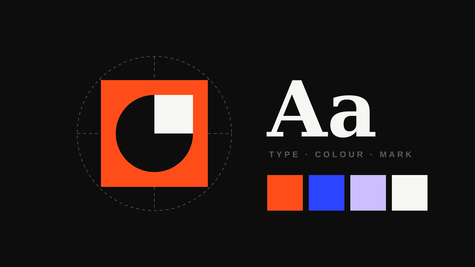
- Logo suite: A main logo plus versions for small spaces, dark backgrounds and social icons.
- Colour and type: A limited palette and one or two typefaces, used the same way everywhere.
- Guidelines: A short document that explains the rules, so the brand stays consistent.
The logo suite
One logo does not fit everywhere. A good identity includes a primary logo, a simpler version for small sizes, a mark or icon for social media profiles and favicons, and versions that work on light and dark backgrounds.
Colour palette
A small set of colours, each with a job: a main brand colour, one or two supporting colours and neutrals for text and backgrounds. Each colour is defined for print and screen so it looks the same on a sign, a business card and a website.
Typography
One or two typefaces, with clear rules for headings, body text and small print. Type does a surprising amount of the work in making a brand feel premium, friendly, technical or playful.
Imagery and graphic style
The kind of photography you use, how it is edited, and any shapes, patterns or illustration styles that run through your materials. This is often what makes a brand recognisable before anyone reads the name.
Tone of voice
How you write is part of your identity too. Are you formal or chatty? Do you use jargon or avoid it? A few simple principles with examples keep your website, emails and social posts sounding like the same business.
Consistency is what turns a set of nice designs into a brand people remember.
Brand guidelines
All of this is written down in a short guidelines document. It does not need to be a hundred pages. It needs to answer the questions a designer, printer or new member of staff will ask, so the brand stays consistent long after the project is finished.
Thinking about a new identity or a refresh? See our branding work.